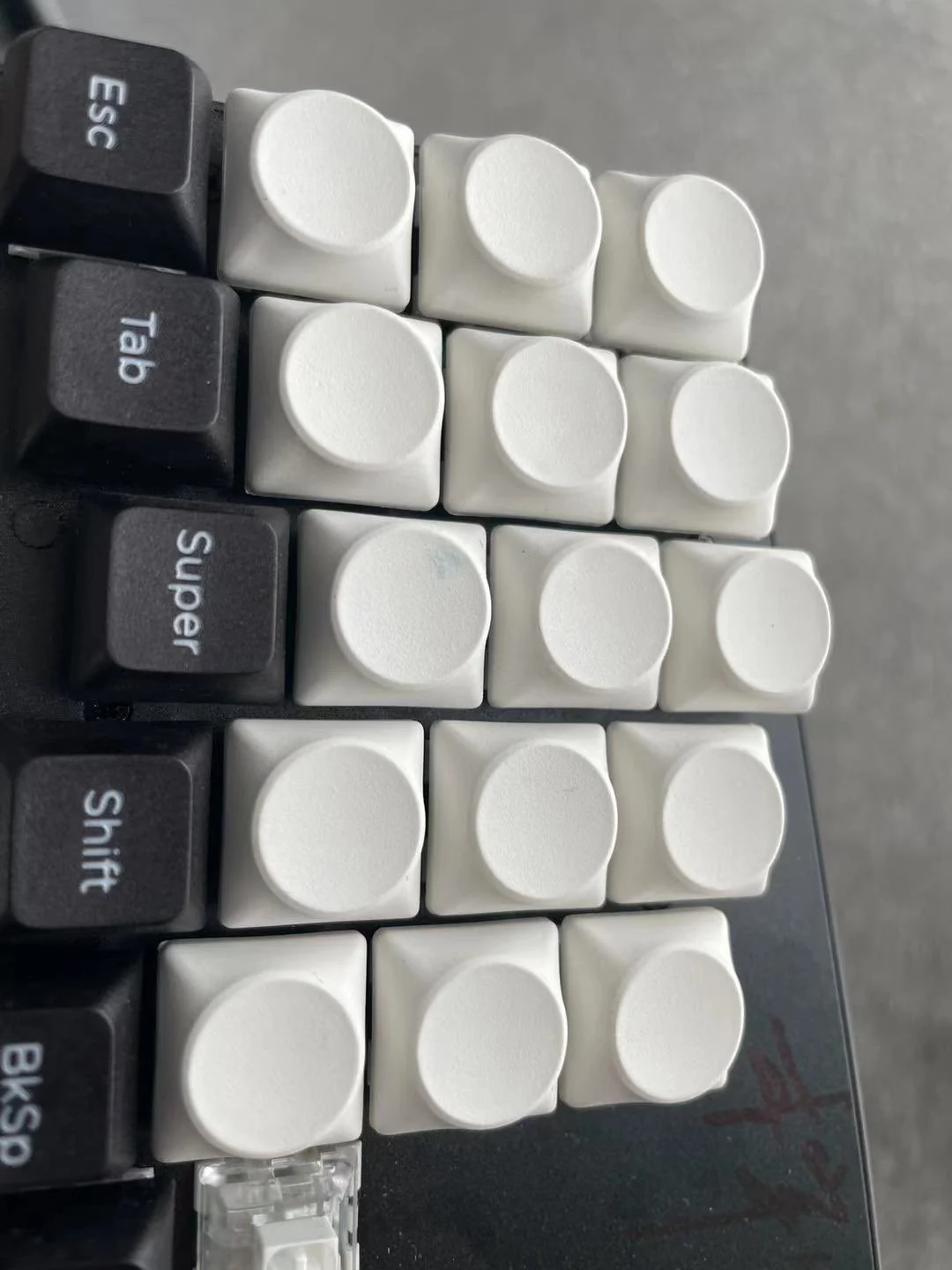
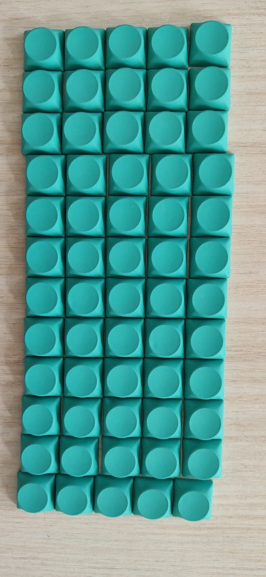
An Overview
A long time ago, way back in college, I made a custom keycap set - DSA Otaku - which you can read about! This one was kinda my entry into doing this sort of thing - it was basically designing some legends for an already-existing keycap profile.
However, I later did another keycap set - SLK Dessau - which is way more ambitious than DSA Otaku. This keycap set is a whole new keycap profile, which I designed through lots of iteration and prototypes, and I had to figure out how to get these manufactured, and run a group buy, and get orders fulfilled!
Check out the final product details here!
It Started with Rhythm Games
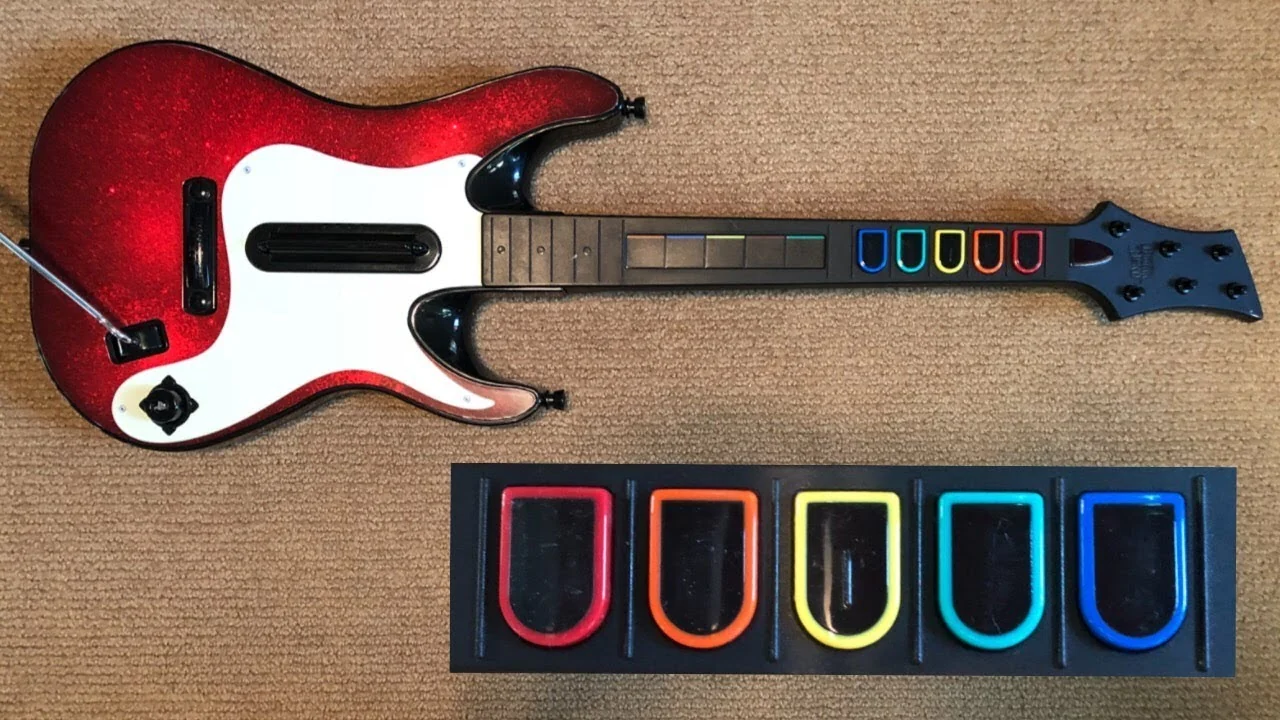
I've been pretty interested in rhythm games, and at one point of time was getting into Clone Hero. I felt that the old controllers were pretty out of date, and not great quality to begin with, so I became interested in making a custom Clone Hero controller. I felt the GH3 controller buttons were pretty iconic and wanted to have a similar feel to them in terms of shape.
Other Inspiration
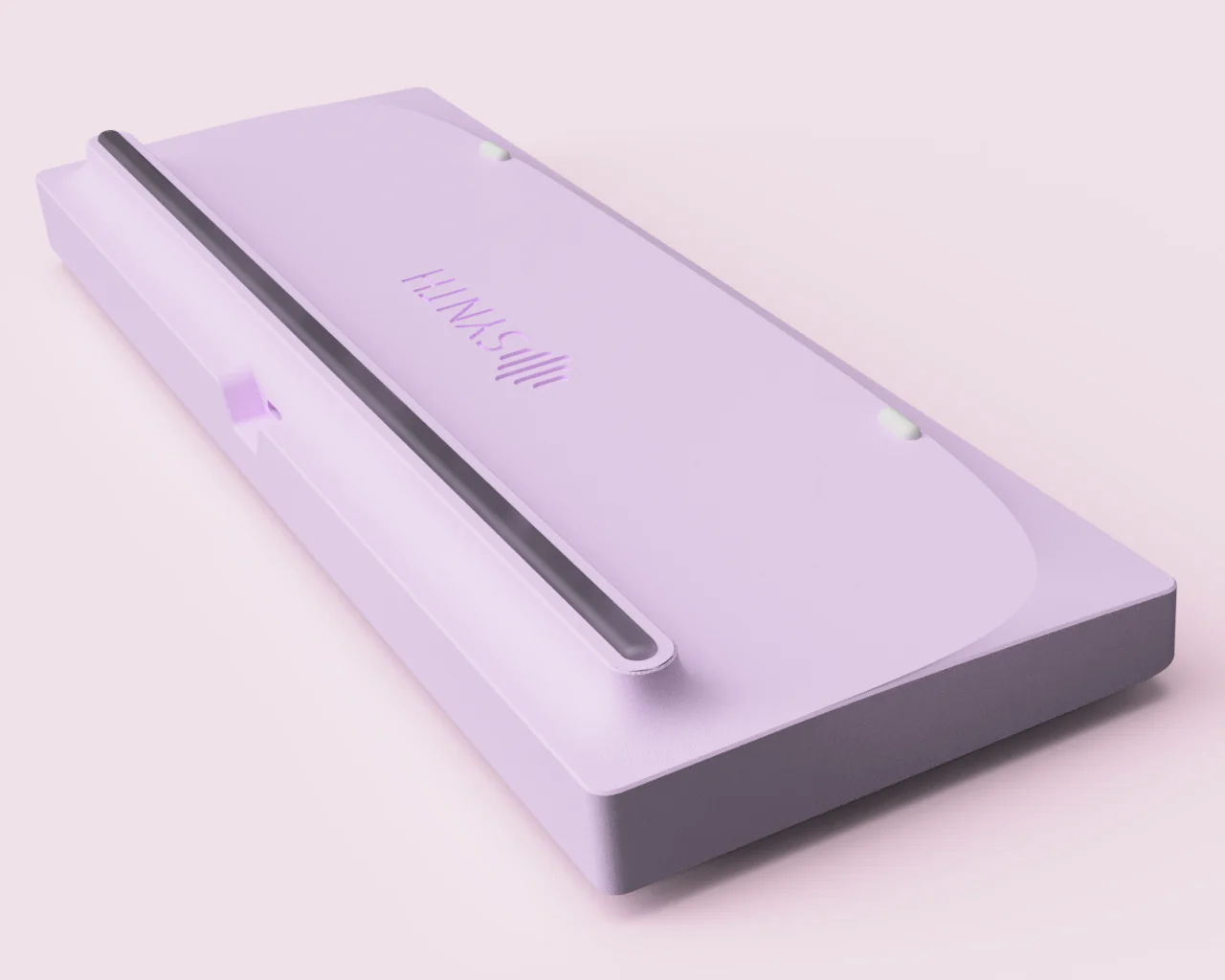
Meanwhile, I've been thinking about making a keyboard with large simple shapes, connected by smooth, sweeping futuristic curves, remniscent of the design from the Enterprise of the 2009 Star Trek reboot film.
This is that keyboard - a 65% I designed which is still WIP - the design actually wasn't fully realized until after this keyset (this render is actually more recent then some of the next renders you'll see), but this render encapsulates what was in my head at the time.
Goals for this Design
I wanted to cover a few things with this controller.
- First off, to use readily accessible Kailh Choc switches, since they have short travel-distance like a GH fret button
- Second, design the controller so that regular Choc keycaps could be used as replacements, so I'm not making some annoying proprietary stuff.
- Third, to make the buttons reversible, so you can flip them 180 degrees to make it work for lefties (this basically goes hand-in-hand with the previous point).
- Lastly, there should be enough key separation to be able to distinguish the buttons purely by feel
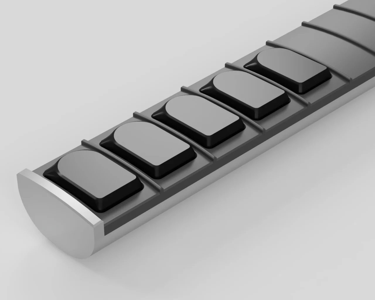
An Initial Design
So I ended up with the classic GH3 (asymmetrical) top shape swept into a more standard rectangular (and symmetrical) bottom shape. This contoured transition makes sense to me from an ergonomic perspective for this usecase, rather than a harder transition like Siemens or Teletype - since the inner-joints of your fingers might touch this area a lot.
In this initial design, the tops were just completely flat, which was appropriate for this usecase (maybe even convex makes sense).
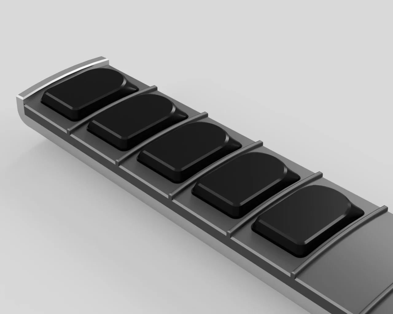
Spawning Other Projects!
The guitar controller project was taking a while and seemed a bit out of scope, and something I'd have to come back to later. I thought it would be cool to see how some of the work from there translates to a keyboard.
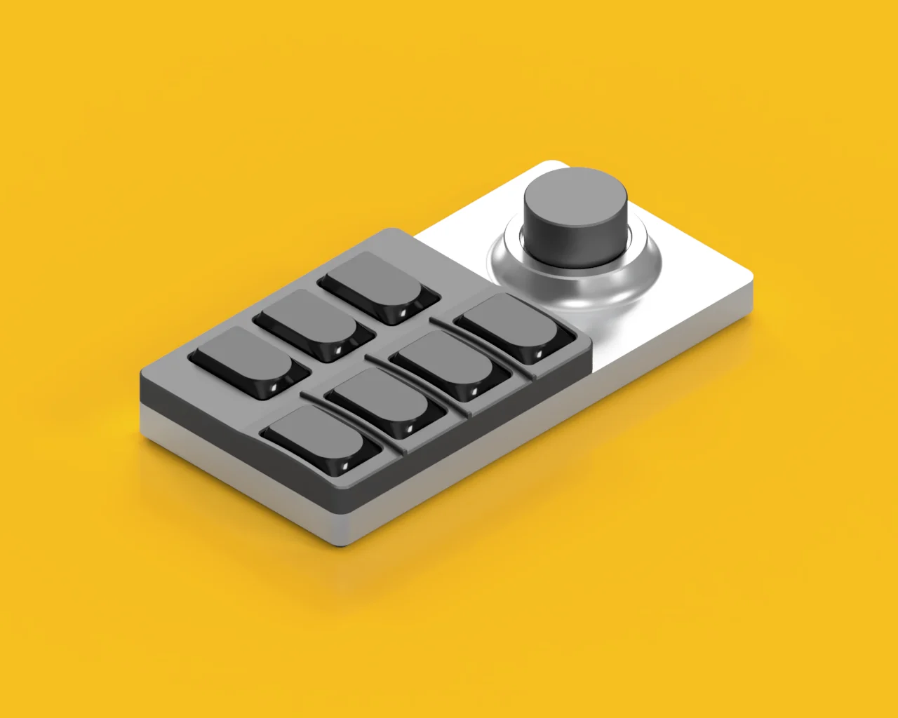
So I took some of my favorite parts of it to a Bemani controller / macropad. Basically this macropad is designed around that section of the guitar - buttons and everything included.
This project became what is now known as the Synth Labs Solo. Read about it in my other writeup!
And Another One...
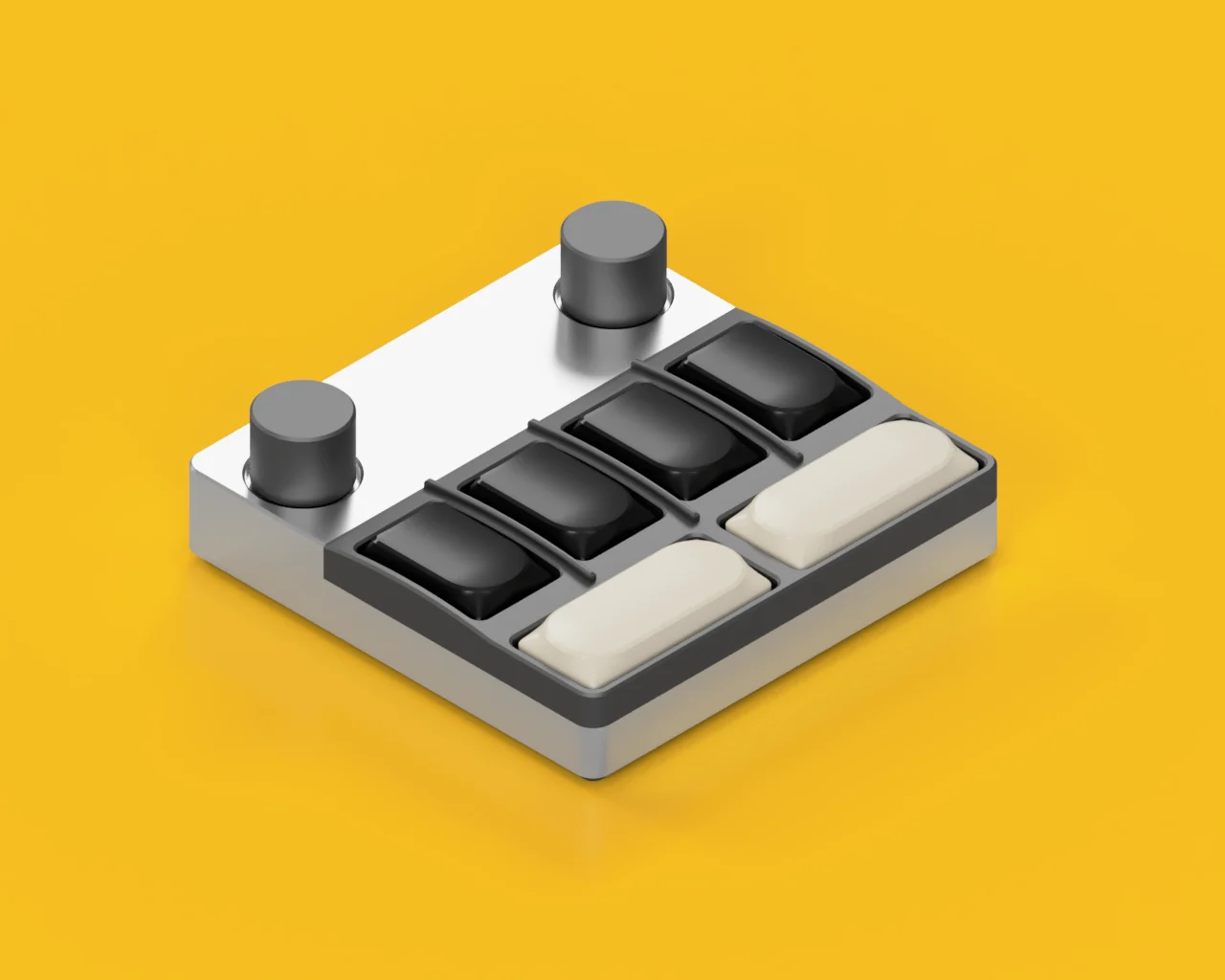
And also did an SDVX-controller / macropad, which added in some 2.25u buttons. For the horizontal buttons, I felt it would be more appropriate aesthetically to have them be symmetrical.
(This macropad is still WIP - I will absolutely come back to this one day)
Prototyping
Tackling these macropads with their custom keycaps would still be quite a lot new things to work on and introduce at once. I broke it down even further, and decided to just focus on the keycaps, then I can introduce the macropads later to compliment them at a later time.
Decided to push it towards just being a Kailh Choc keyset, since I can test that on its own and it would have appeal independently, as opposed to doing the macropad first, which I didn't feel had as much appeal if it had some other keycaps on it.
Here's some early protos ordered from a 3D print service using MJF printing. They were more angular at the time, since I was still learning how to do the curves nicely.
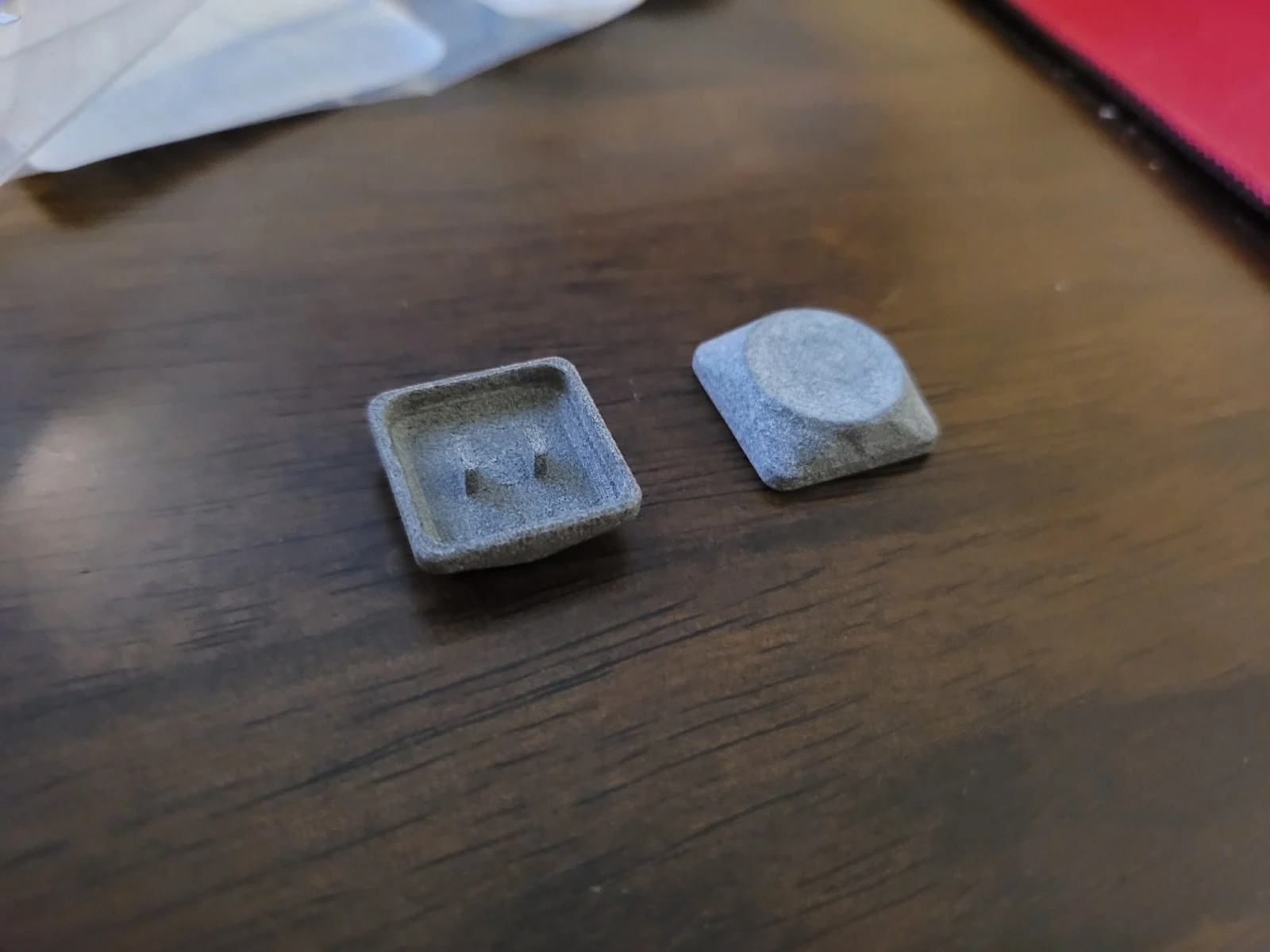
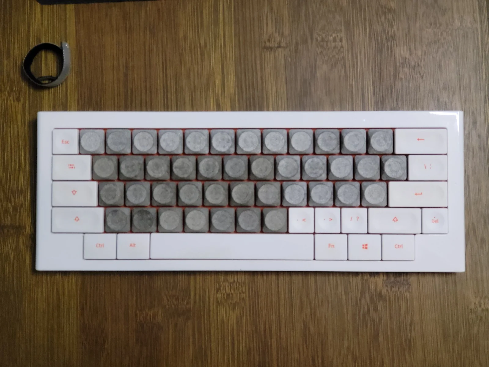
More Prototyping
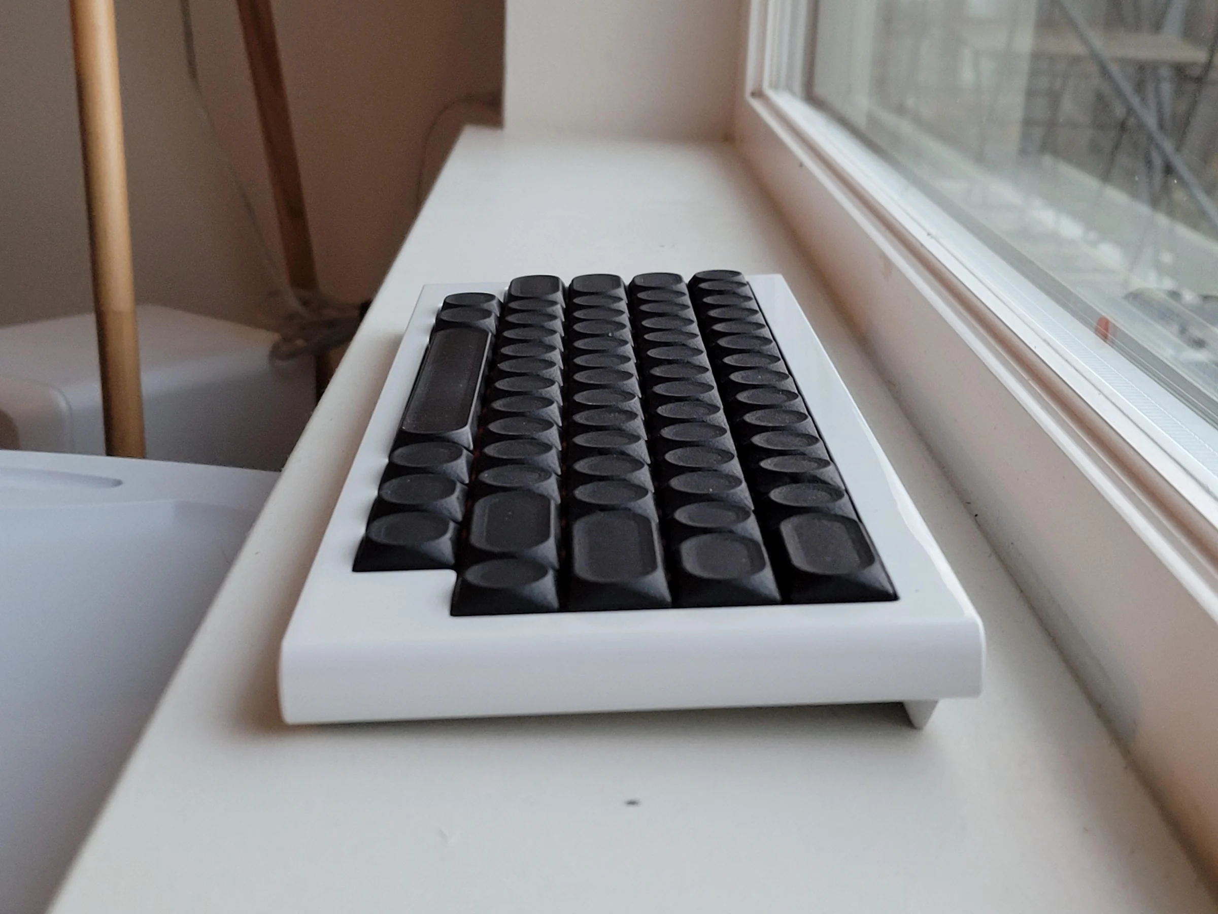
Some later dyed MJF prints, with some minor changes to contouring to make it a bit smoother. The dish here is flat in the middle, because the dish radius is smaller and doesn't converge in the center.
This is because I still had those asymmetrical "GH3-shaped" keys in mind as well, and those keys had one end with "squarer" corners which couldn't be radiused as much. I did figure out how to redesign that more properly later, but this was the temporary solution at the time.
Switching to MX
Later, I looked around for manufacturers and people involved the community with making custom keycaps/profiles. I came across FK Caps which had an interesting vision. I reached out, and they were interested!
We had a discussion about where it can fit in the market and where I'd like to see it. We determined Choc will be easier since it's less competitive despite having the smaller market, but MX conversely has the bigger market but also the more competitive one.
I decided I wanted to do MX, even though it was challenging, for a simple reason - because I use MX primarily. The keycap profile *did* start off as Choc, but that was pretty much just because it was designed as a part of bundle that fit a particular purpose (emulating Guitar Hero controller feel) and aesthetic. I think outside of the bundle, as a standalone keycap, MX is a stronger fit.
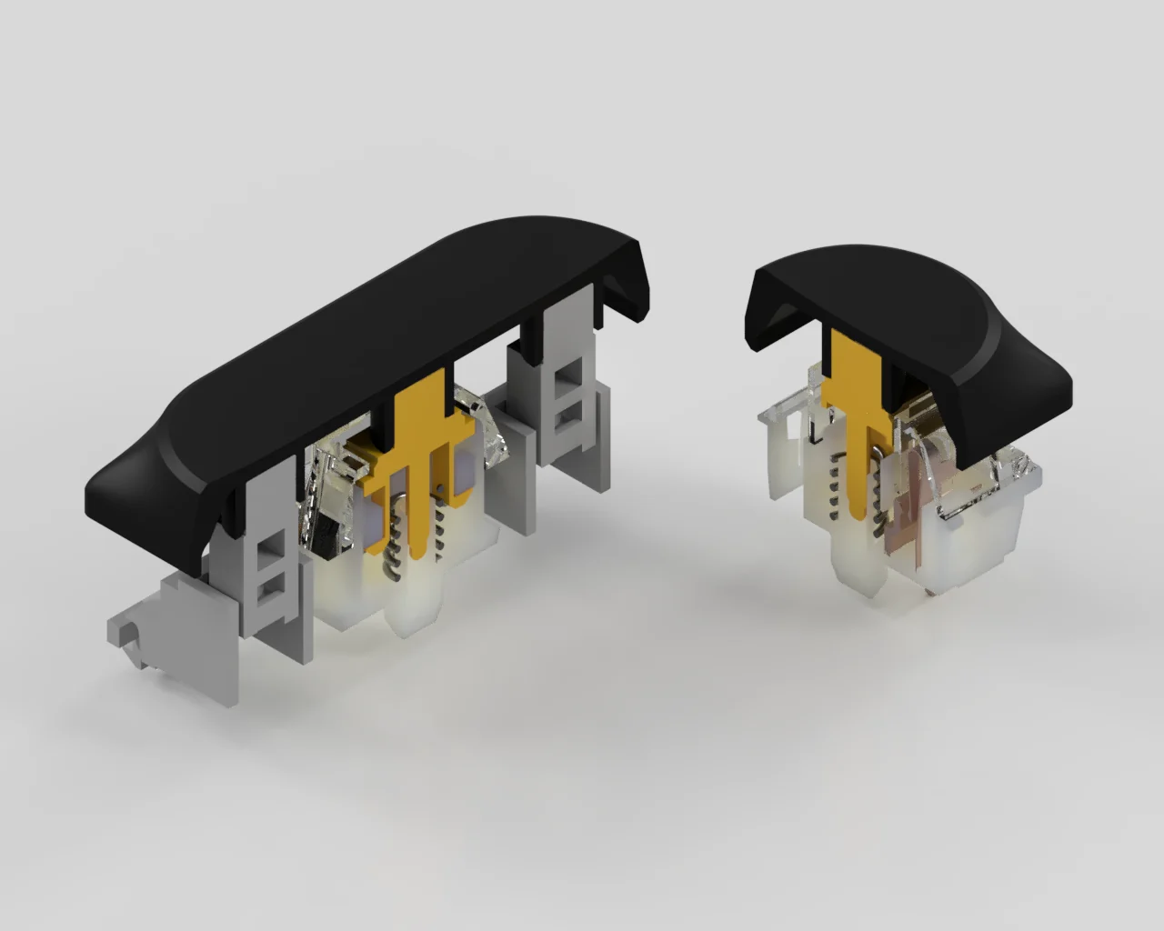
Here's a render of an early test-fitting setup I was using in Fusion 360 - to figure out how to readjust dimensioning for MX.
First MX prototypes, now 3D printing myself
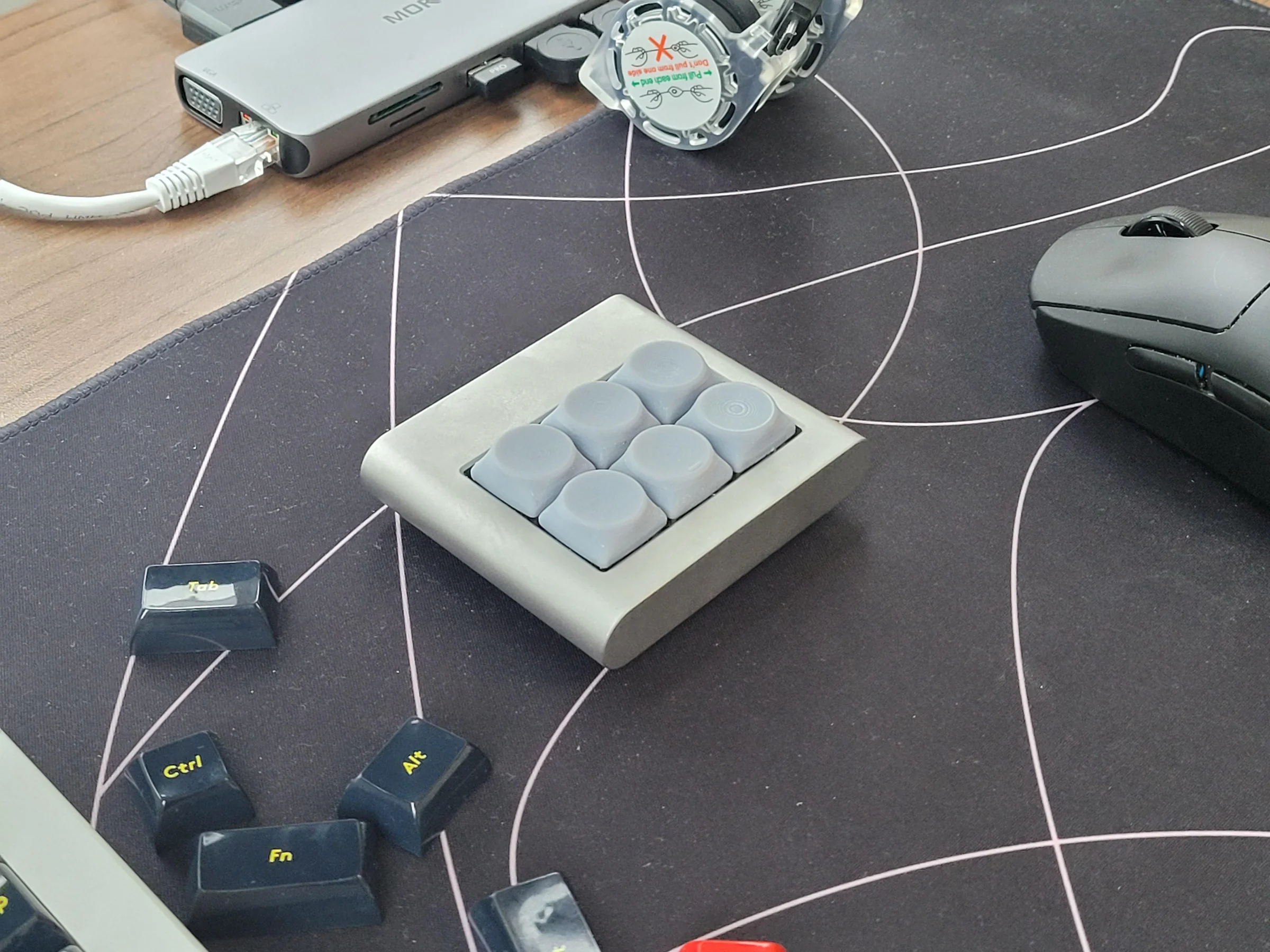
Here's the first prototypes of the version adapted for MX (which means being slightly taller, having MX stems and such), and also have further refinements. The dish curvature has been adjusted to be perfectly spherical.
Also, starting with this prototype, I did the 3D printing myself with a resin printer that I now own, since the costs are much cheaper than ordering from the print service, and I can do more small iterations.
Getting Others Involved
Since I knew getting a new MX profile to market and adopted will be challenging with how competitive the MX keycap market is - I felt that it's important to have a debut keyset design to go along with the profile. Blanks alone probably wouldn't cut it in this competitive space.
I asked my favorite designers in the keyboard community if they would be interested, and didn't take long to hear back from Kema, whose work I was a big fan of! After a while, he came up with the design now known as Dessau. Since then, it's been super collaborative - lots of back and forth feedback between kema, FK Caps, and me for all aspects. Kema and FK Caps input has certainly helped inform some design decisions with the profile over the course of the project since they joined.
I sent Kema a 2D template texture that he could edit to make his own legend design, and not too long later, he had a first design - and it looked great!
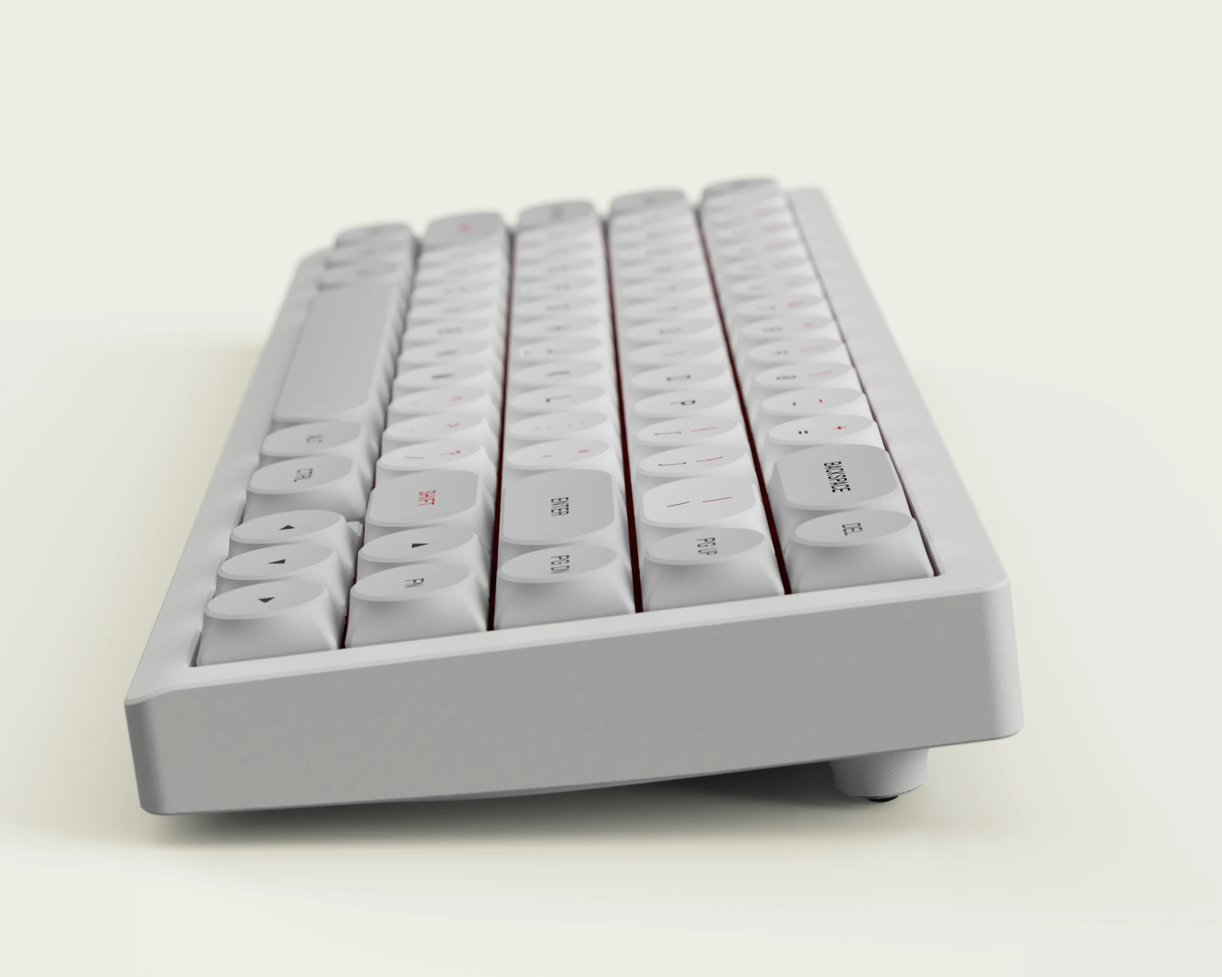
Here are some of the earlier renders with an older variant of the profile, rendered in Fusion 360. UV mapping in Fusion 360 is a HUGE pain in the butt, and it gets fully erased whenever you modify the model, so this didn't last long (later, I'd move the rendering workflow to Blender). Also, as you can see, this variant was SUPER flat - with the goal of making SLK as thin as possible while maintaining 1.5mm thickness. I'll touch upon this more later.
Moving to Blender Rendering
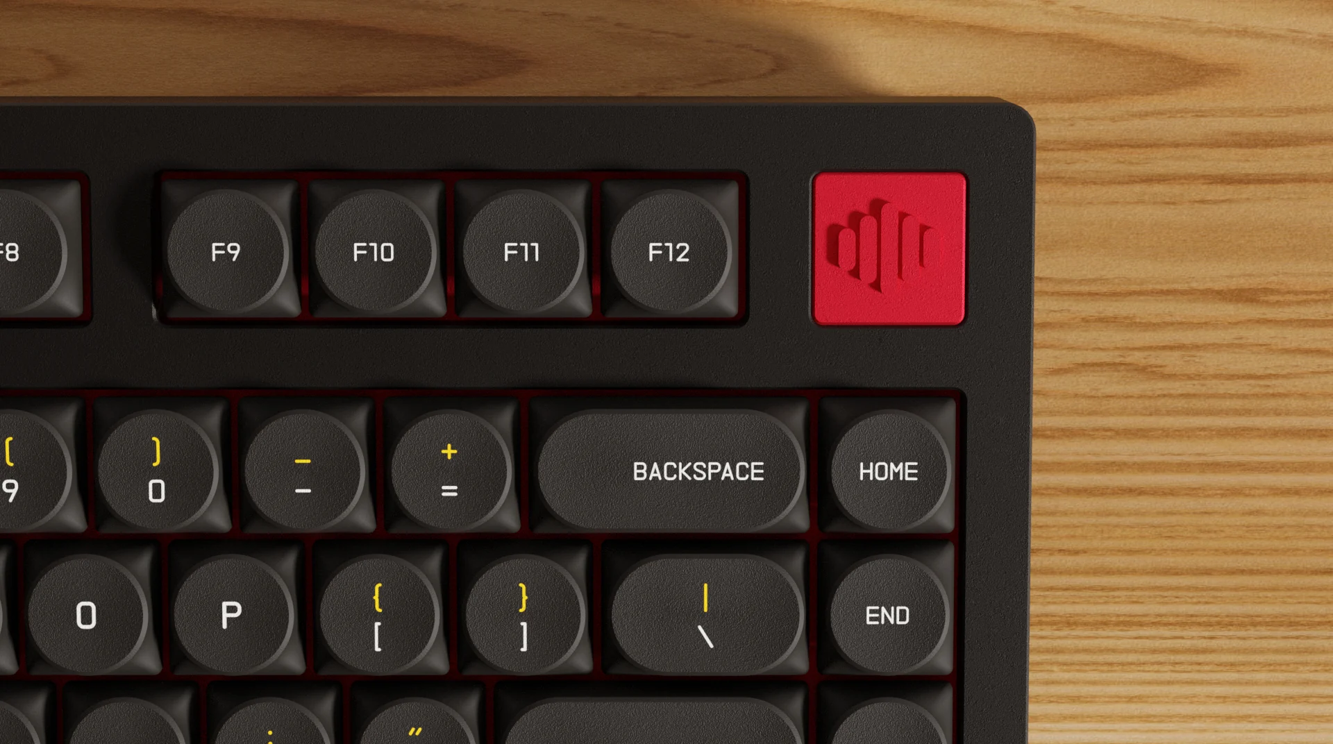
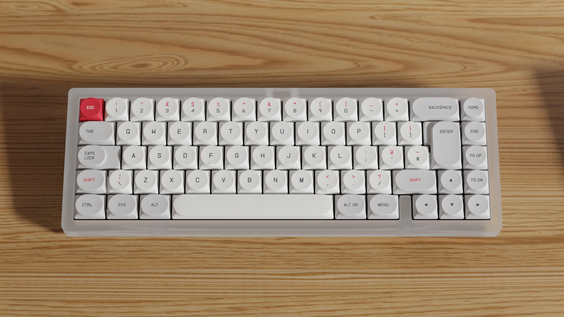
Later, we transitioned the rendering into Blender. Lots of collaboration involved here to figure out a workflow that both Kema and I could use comfortably. For our renders, Kema did most of the staging, lighting, composition, and setup to get the shots, while I just focused on making new materials to be able to use, updating models when we had new variants, and adding stuff to improve the workflow.
Another nice change shown here is the change from center-aligned to edge-aligned legends.
Continuing to Improve the Profile
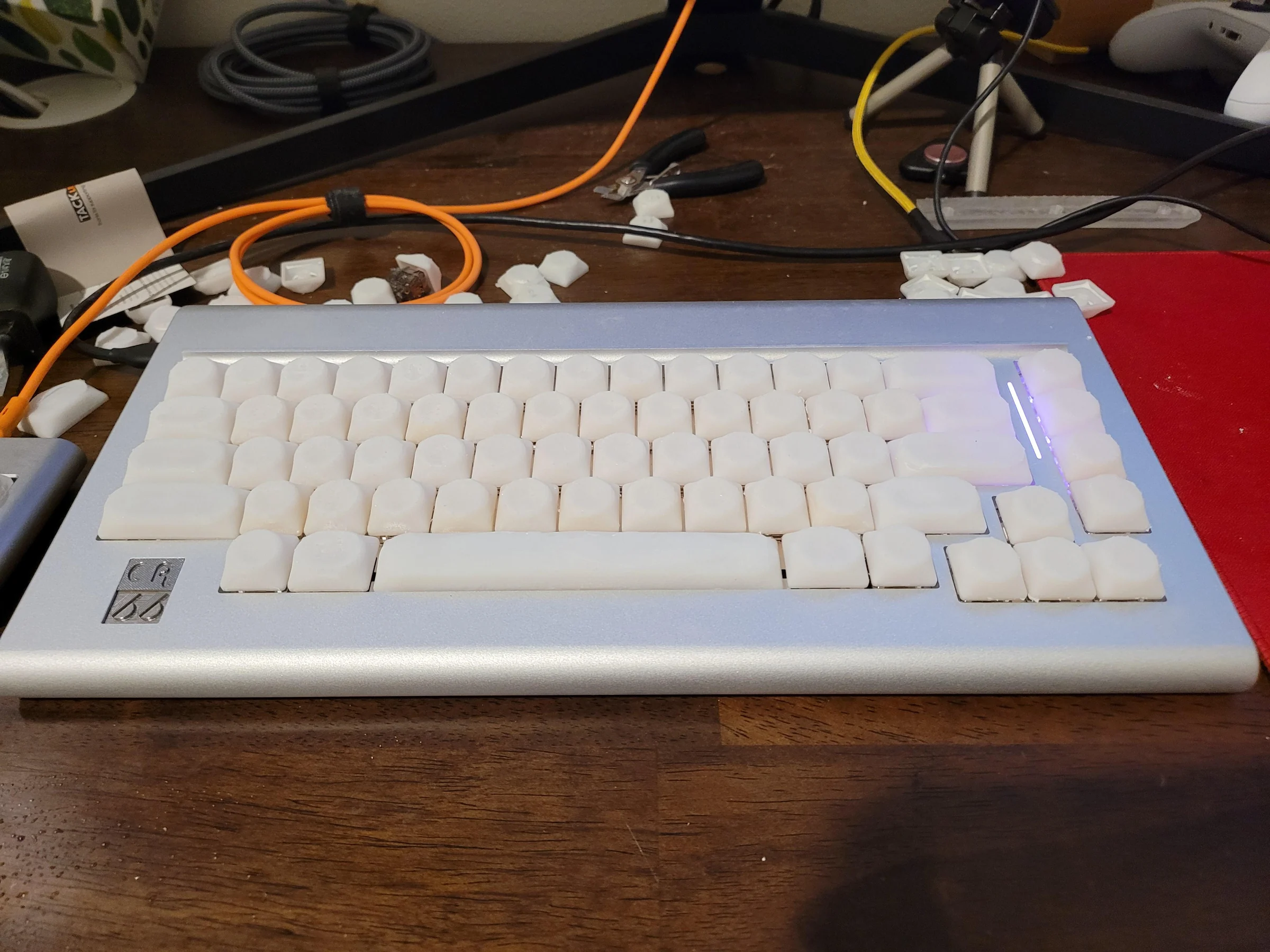
More 3D Printed iteration, extending to the whole keyboard to test all the mods and general typing experience.
Printing a full keyset takes a lot of time, a lot of resin, and a lot of IPA (for cleaning the parts). Lots of IPA was reused to try to be frugal, but fresh IPA was always used on runs where I thought the print absolutely needed to come out high quality. In retrospect, I should probably try using water-washable resin next time.
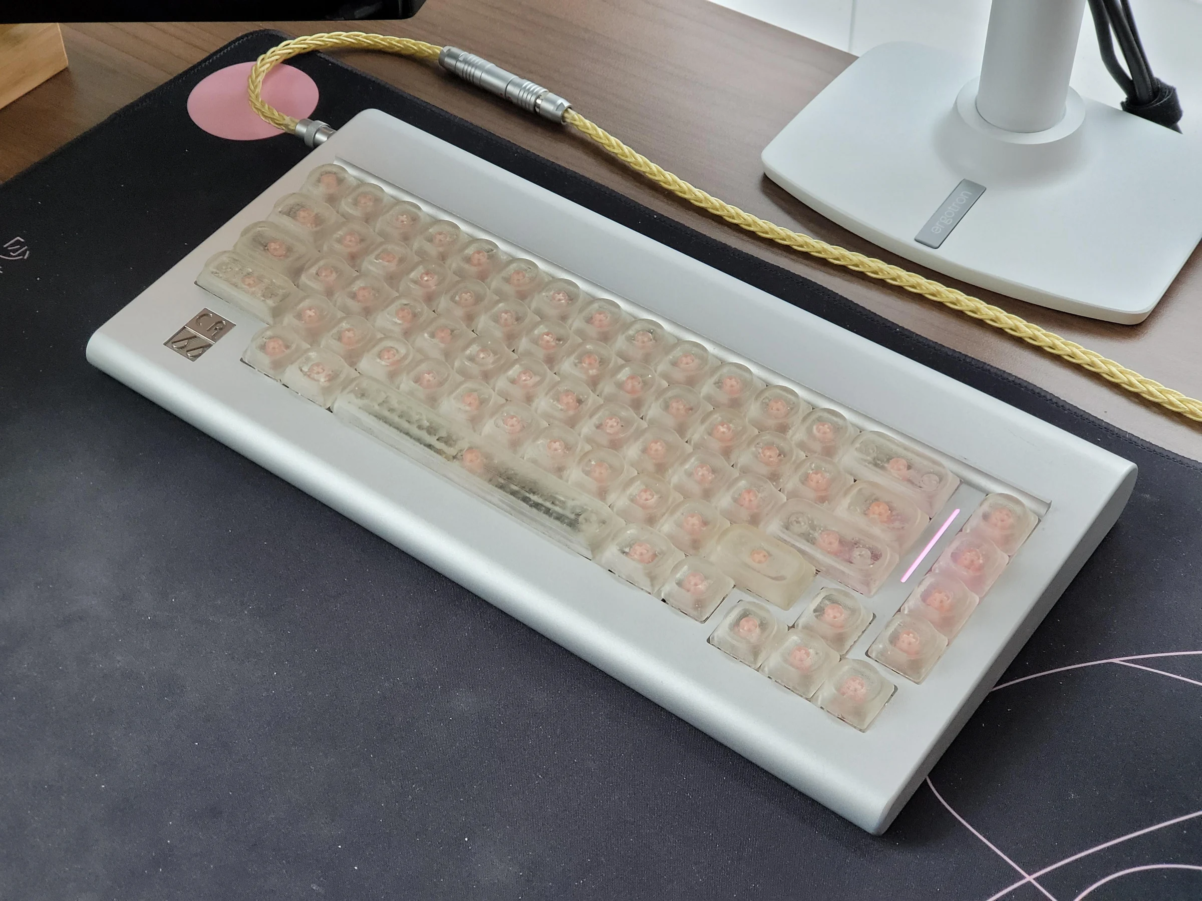
Iterating Step-by-Step!
I use different colors so I can remember which version each one is, since the differences are pretty subtle. The changes do add up, but between each iteration I'm just making minor tweaks at a time.
Between each iteration I'd put the caps on a keyboard and use them for a bit, doing various tasks like sometimes doing typing tests to get a feel for them, or sometimes playing some games.
Most of the changes were to the dish diameter/depth/curvature, and to the inner geometry focusing on fitment with different types of switches from various manufacturers.
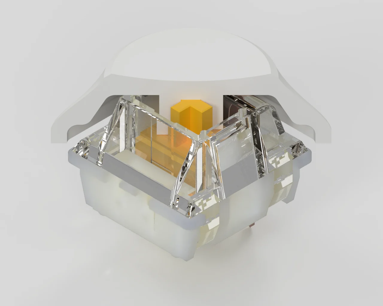
Test-Fitting Virtually
Also continued to do test-fitting virtually when working on interior changes, since this is faster than 3D printing. Ultimately, I end up doing 3D prints for the final tests anyway, just for peace of mind, and also because the virtual test-fitting is too "perfect", and doesn't account for things like stem wobble. Fitting issues due to stem wobble was most prevalent on 1.75u's, since they are the largest non-stabilized key.
It's important to analyze the crosssections from different angles, such as this isometric one to make sure there is enough clearance in all axis.
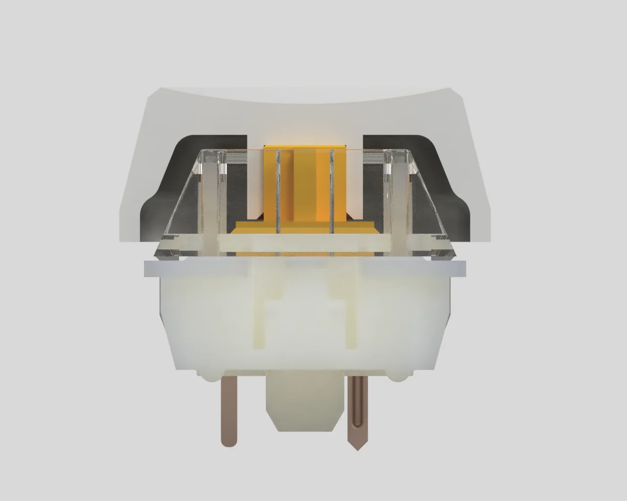
Significant Tweaks
An early change identified from both comments in the IC and from testing was changing the dish size and curvature (kema notes this V1 -> V2 change in the IC post). You can probably see that the variant in this render (and the last one) is more curved than the previous renders.
The dish size and curvature in V1 was inherited from the old Choc design, which typed well as a Choc profile. However when raised taller, and made into an MX profile with longer travel distance (this is the main factor), it was a bit too easy to accidentally hit adjacent keys.
After printing full keysets several variants with different dish sizes and curvatures, and testing out typing with each of them, we chose one which hit the goldilocks spot of feeling just right (which we now refer to as V2).
The internal design shown here fits all the switches we've tested it with quite well. In theory it should all be good, but later we would encounter challenges with the injection-molding process, and these internals would be redesigned a few more times again.
Submitting the First Design for Manufacturing
At this point, we submitted the 1U keycap design to the manufacturer. The manufacturer also 3D prints it with a resin printer just like I did, and does their own test fitting to confirm things are right on their side.
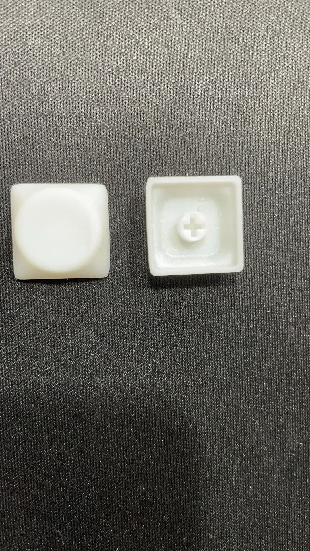
First T1 Samples
Manufacturer has made their first T1 samples (a prototype made from low-lifespan molds). These are pictures from the factory.
We also got some tests on the dip-dye capabilities. This was pretty opportune, since FK Caps was already researching this area with their MBK caps, and SLK prototypes happened to be lying around. This would come in handy for the production process later on.